
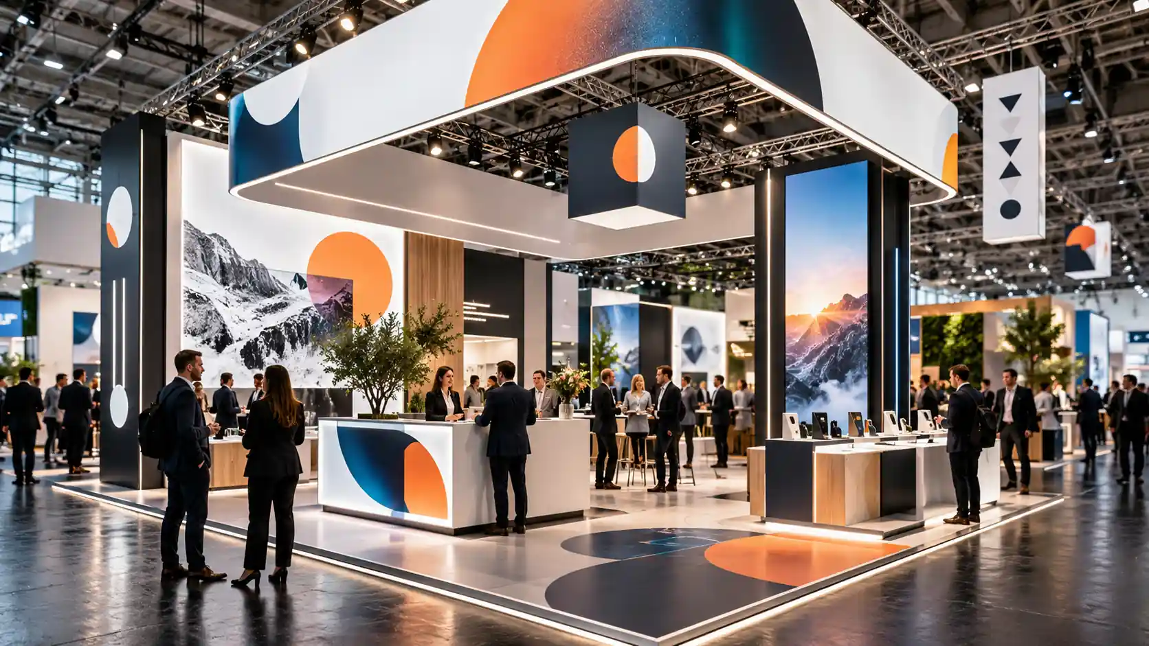
What trade show signage is and what it should accomplish
Trade show signage turns booth architecture into a communication system. Its role is not simply decorative: it should help visitors identify a brand, understand its value proposition, and navigate the space.
Trade show signage: a coordinated system of graphic, textual, three-dimensional, and wayfinding elements used to identify, inform, and guide visitors within a trade show or conference.
It may include logos, vinyl graphics, fabric graphics, printed panels, dimensional lettering, lightboxes, wayfinding signage, floor graphics, and other visual elements integrated into the booth.
An effective solution performs four functions: attract, identify, explain, and guide. These functions are repeated at different scales, from signage visible across the aisle to a graphic positioned next to a product.
Signage should be designed together with booth architecture, lighting, and visitor flow. If it is added after the booth has already been defined, space, visibility, and installation constraints may appear that could have been avoided.
The following ten elements provide a systematic framework for evaluating a trade show signage strategy.
- 1. Objective: define what each element needs to accomplish.
- 2. Identity: maintain brand recognition and consistency.
- 3. Hierarchy: organize messages by importance.
- 4. Readability: make sure information can be read clearly.
- 5. Distance: adapt content and scale to the viewing point.
- 6. Color: control contrast and color consistency.
- 7. Substrate: choose the right material for each application.
- 8. Lighting: use light as part of the graphic system.
- 9. Integration: connect graphics, visitor flow, and wayfinding.
- 10. Execution: produce and install with precision.
The 10 key elements of effective trade show signage
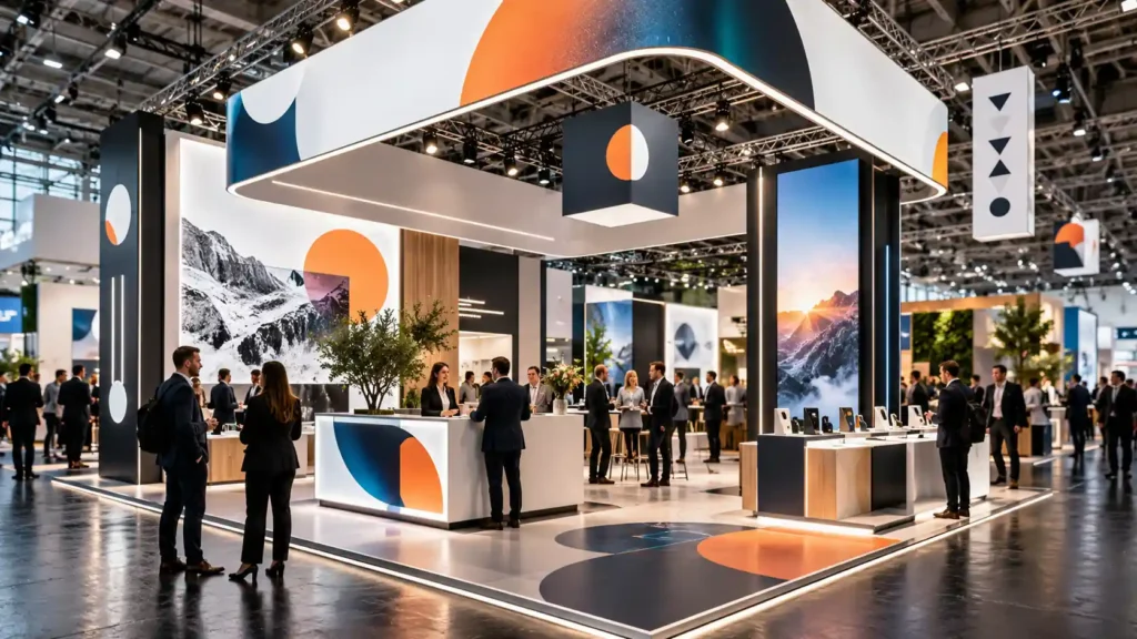
1. A defined objective. Every element should have a specific function. A graphic may identify the company, attract attention from the aisle, explain a product, guide visitors toward an area, or encourage an action.
A common mistake is trying to make one surface perform too many functions at once. An elevated logo needs immediate recognition, while a graphic next to a product can accommodate more detailed information.
Practical criterion: before producing any element, you should be able to complete the sentence “this element should help the visitor…”. If the answer is unclear, its function probably is too.
2. Brand identity. Colors, typography, photography, iconography, materials, and graphic style should work together as a recognizable system.
Consistency does not mean repeating the logo everywhere. It means making sure every element communicates the same brand personality and positioning.
Architecture and graphics should also be aligned. A booth intended to communicate precision or quality can lose credibility if its finishes, lighting, or signage appear improvised.
3. Visual hierarchy. Information should tell the visitor what to look at first, what to understand next, and what to explore once interest has been established.
Visual hierarchy: the organization of elements according to importance using size, position, contrast, typographic weight, and available space.
- Level 1: brand and primary value proposition.
- Level 2: products, applications, or benefits.
- Level 3: technical details, use cases, supporting information, and calls to action.
If every message has the same visual prominence, visitors must decide for themselves what matters. Strong hierarchy makes that decision in advance.
4. Readability. A message only works if it can be read under real venue conditions. Size, contrast, length, typography, lighting, and viewing angle all have a direct impact.
A typeface that works well on a website may not perform effectively in large-format signage. Corporate fonts should be adapted when long-distance readability requires it.
Primary signage should not behave like a catalog either. Longer explanations can be moved to technical sheets, screens, brochures, QR codes, or areas intended for close-range reading.
5. Viewing distance. The amount of information should decrease as the viewing distance increases.
Viewing distance: the intended separation between a graphic element and the point from which the visitor should be able to identify or understand its content.
- Long distance: brand and essential message.
- Medium distance: product, category, benefit, or application.
- Short distance: features, technical information, and calls to action.
This model allows signage to guide visitors as they approach the booth. It also requires analyzing which elements are visible from each aisle and from which angles.
6. Color and contrast. Color reinforces recognition, separates information, and directs attention. To work effectively, contrast must remain strong under the lighting conditions of the exhibit hall.
Color management: the set of procedures used to control how color is translated between files, devices, printers, and materials.
ICC profiles describe how different color reproduction conditions relate to one another. In professional signage production, they help control consistency across files, equipment, and substrates.
The same color can appear different on vinyl, fabric, rigid panels, acrylic, or backlit graphics. When a brand color is critical, testing it on the final material is advisable.
7. The right substrate. The material should be selected according to function, surface, duration, finish, installation requirements, transportation, and potential reuse.
- Vinyl: suitable for customizing walls, furniture, glass, and other surfaces.
- Fabric graphics: useful for backdrops, tension-frame systems, and lightboxes.
- Rigid panels: appropriate for wayfinding signage, photography, and standalone elements.
- Dimensional lettering: adds depth to logos and messages.
- Backlit material: allows visual communication to be integrated into lightboxes.
There is no universally superior substrate. The right solution is the one that fulfills its function while balancing visual quality, installation, logistics, and service life.
8. Lighting. Light affects contrast, color, depth, and visibility. It should be defined together with the graphics rather than added afterward.
A wall may use front lighting, while a lightbox requires coordination between printing, diffuser material, and LED distribution. Dimensional lettering may incorporate direct or indirect illumination.
Final validation should take place with the actual lighting system switched on. This makes it possible to identify reflections, dark areas, color shifts, or uneven illumination.
9. Integration with architecture and wayfinding. Graphics should respond to visitor flow and the functional layout of the booth.
Wayfinding signage identifies areas and supports navigation. Branded signage primarily communicates identity and value proposition. Both should share a visual language, but they do not perform exactly the same function.
- Identify: show what is located in a particular area.
- Direct: indicate where visitors should go.
- Inform: explain what can be done at that point.
- Activate: suggest an action such as entering, asking a question, or attending a demonstration.
A demonstration promoted through a large graphic will be less effective if visitors cannot locate where it is taking place. Communication and physical layout should support the same visitor journey.
10. Production and installation. Execution determines whether the system designed on screen actually works once the trade show opens.
Before printing, dimensions, scale, resolution, color, bleed, component breakdowns, and materials should all be verified. The graphics team also needs to know where profiles, joints, doors, and other construction elements will be located.
During installation, alignment, fabric tension, image continuity, signage position, illuminated elements, and surface cleanliness should all be checked.
Coordination between trade show booth fabrication and signage prevents a design that looks correct on screen from becoming incompatible with the actual structure.
How to validate signage before and after installation
A professional review should take place before fabrication and then be repeated once the booth has been installed.
- Objective: every element has a clearly defined function.
- Hierarchy: the brand and primary message dominate secondary information.
- Readability: text works at the intended viewing distances.
- Color: contrast is sufficient and critical colors have been verified.
- Architecture: profiles, doors, or furniture do not block important information.
- Lighting: readability remains strong under the final lighting conditions.
- Visitor flow: wayfinding helps locate products, meeting areas, and demonstrations.
- Finish: there are no obvious wrinkles, bubbles, misalignments, or visual discontinuities.
After the event, performance can also be evaluated through visibility, message comprehension, booth entries, inquiries, interactions, and brand recall.
Not all of these outcomes can be attributed exclusively to signage. Booth location, architecture, pre-show promotion, products, and the sales team also influence results.
For that reason, comparing similar events is more useful than attributing any increase in leads to a single visual variable.
How Full-Expo integrates signage, printing, and booth construction
Full-Expo currently includes trade show booth fabrication and installation, signage, large-format printing, dimensional lettering, illuminated signage, and lighting among its services.
This combination makes it possible to develop graphic communication within the same technical project that defines walls, structures, furniture, and lighting points.
The workflow can begin with a review of drawings and surfaces, continue through artwork preparation and graphic production, and end with installation and on-site quality control.
Integration also makes it possible to combine solutions according to function: fabric graphics for large backdrops, vinyl for specific surfaces, rigid panels for information, and dimensional elements to strengthen brand identification.
Full-Expo also describes a single-point-of-contact model coordinating design, production, and logistics. This centralized approach can reduce incompatibilities when architecture, graphics, and lighting depend on one another.
The objective is not to use more signage elements. It is to select the ones required so that visitors can recognize the brand, understand its value proposition, and navigate the booth.
The ten elements therefore return to the same original system: objective, identity, hierarchy, readability, distance, color, substrate, lighting, integration, and execution.
When all of them support the same strategy, trade show signage stops being decoration and becomes a functional part of the booth and its commercial communication.
Frequently asked questions about trade show signage (FAQs)
It is the system of graphic, textual, and three-dimensional elements used to identify a brand, communicate information, and guide visitors within a trade show booth.
Branded signage primarily communicates identity and commercial messages, while wayfinding identifies areas and helps visitors move through and use the space.
There is no universal solution. Vinyl, fabric, rigid panels, dimensional lettering, or backlit graphics should be selected according to function, surface, viewing distance, duration, and installation requirements.
Consider viewing distance, height, message length, contrast, and the angle from which visitors will approach.
The primary graphics should prioritize the brand and the essential value proposition. Products, benefits, and details can be distributed across levels designed for progressively shorter viewing distances.
It should be planned together with the architecture before fabrication and lighting are finalized, ensuring compatible dimensions, substrates, and locations.
Yes. Signage, fabric frames, panels, and other components can be reused when they are designed for dismantling, transportation, storage, and future installations.
It can be analyzed through visibility, comprehension, wayfinding, booth entries, interactions, and brand recall, while comparing similar events and accounting for other variables.