
Graphic Design as the Driver of Attention at Trade Shows
In a trade show environment, visitors make decisions in seconds. They walk through crowded aisles, receive constant stimuli, and quickly filter which booths deserve their attention. In this context, graphic design for custom trade show booths becomes the first point of contact between the brand and the visitor.
It is not just an aesthetic issue. Graphic design determines whether a booth is perceived as relevant, easy to understand, and visually appealing. Its role is clear: stop the visitor, communicate a message, and trigger an action.
Within the Booth Marketing and Promotion cluster, graphic design acts as the system that connects visibility with business results. This article develops a structured approach to understanding its impact and how to apply it effectively at trade shows and conferences.
Operational Definition: What Graphic Design in Booths Is
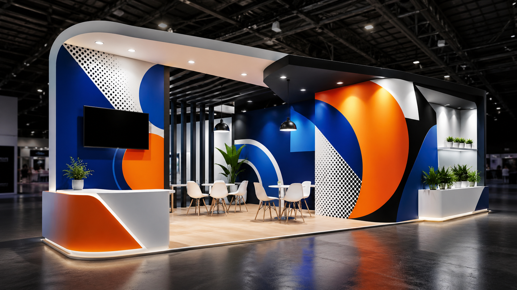
Graphic design for custom trade show booths (definition): the set of visual elements (typography, color, composition, imagery, and signage) that communicate a company’s value proposition within an exhibit space.
Main function: turn a physical space into a visual message that is easy to understand and action-oriented.
Expected result: a higher number of qualified visitors, better product understanding, and more business interactions.
The Visual Impact Framework: How Graphic Design Works in a Booth
To understand its importance, graphic design should be analyzed as a system with four interconnected functions:
- Attraction: capture the visitor’s attention.
- Communication: deliver the message clearly.
- Hierarchy: organize visual information.
- Action: guide the visitor toward an interaction.
This same framework applies at every level of the design, from the booth façade to the internal details.
Attraction: How to Capture Attention in Seconds
The first function of graphic design is to stop the visitor. Without attention, there is no interaction.
Key Elements of Attraction
- Color contrast: improves visibility.
- Scale: large elements create impact.
- Simplicity: less visual noise, more clarity.
The goal is not to be complex, but to be visible and easy to understand from a distance.
Practical Example
A booth with a neutral background and a clear high-contrast message will be more effective than one with multiple colors and scattered text.
Communication: Deliver the Message Without Effort
Once attention has been captured, the design must quickly explain what the company does.
Clarity Rule
- The visitor should understand the business in less than 5 seconds.
Message Structure
- Who you are
- What you do
- Who you do it for
This structure reduces ambiguity and improves relevance.
Visual Hierarchy: Organizing Information
Graphic design does not just display information, it organizes it. Visual hierarchy defines what the visitor sees first, then next, and finally last.
Reading Levels
- Level 1: logo and main message.
- Level 2: benefits or differentiators.
- Level 3: details and proof.
Proper hierarchy reduces the visitor’s cognitive effort.
Common Mistake
Giving every element the same level of importance, which creates confusion.
Action: Turning Attention into Interaction
Graphic design should guide the visitor toward a specific action.
Examples of Actions
- Request information.
- Join a demo.
- Speak with a sales representative.
Without this phase, the design loses its commercial purpose.
Key Elements of Graphic Design in Custom Booths
Typography
- It must be readable from a distance.
- Avoid overly complex fonts.
Color
- It should create contrast.
- It should be consistent with the brand.
Imagery
- It should reinforce the message.
- Avoid generic stock-style images.
Composition
- Visual balance.
- White space to improve readability.
Comparison: Effective vs. Ineffective Graphic Design
- Clear message vs. confusing message
- Defined hierarchy vs. visual disorder
- High contrast vs. low readability
- Clear action vs. lack of direction
How to Design a Booth with Strong Visual Impact: A Practical Method
Step 1: Define the Goal
- Lead generation
- Brand awareness
- Product launch
Step 2: Define the Main Message
One clear idea only.
Step 3: Build the Hierarchy
Organize information into levels.
Step 4: Apply the Visual Design
Color, typography, and composition.
Step 5: Validate with Real Testing
Check readability and understanding.
How Full-Expo Applies Graphic Design in Custom Booths
Full-Expo approaches graphic design as an integral part of the booth. It is not about adding graphics at the end of the process, but about designing the message from the very beginning.
- Integration between design and structure.
- Use of digital tools to validate impact.
- Adaptation to each type of trade show and audience.
This approach makes it possible to create booths that not only stand out, but also work as commercial tools.
Common Mistakes in Trade Show Booth Graphic Design
- Too much text: reduces readability.
- Lack of contrast: makes reading harder.
- Unclear message: reduces interest.
- Design without a goal: fails to generate results.
Conclusion: Graphic Design as a Competitive Advantage
Graphic design for custom trade show booths is one of the most decisive factors in booth success. It goes beyond aesthetics and acts as a system that connects visibility, understanding, and action.
In a competitive environment like European trade shows, where every second matters, effective graphic design can make the difference between capturing opportunities and being overlooked.
Working with a professional approach, like the one developed by Full-Expo, makes it possible to turn design into a strategic tool that drives real results.
Frequently Asked Questions About Graphic Design in Booths
It is the set of visual elements that communicate a company’s value proposition within an exhibit space.
Because it determines whether a visitor stops, understands the message, and decides to interact.
With a clear message, strong contrast, visual hierarchy, and a simple design approach.
Colors that create contrast and stay consistent with the brand.
Only the minimum necessary to communicate the message in a few seconds.
By applying hierarchy, reducing visual noise, and using clear, highly visible elements.
Too much information, lack of clarity, and no defined objective.