
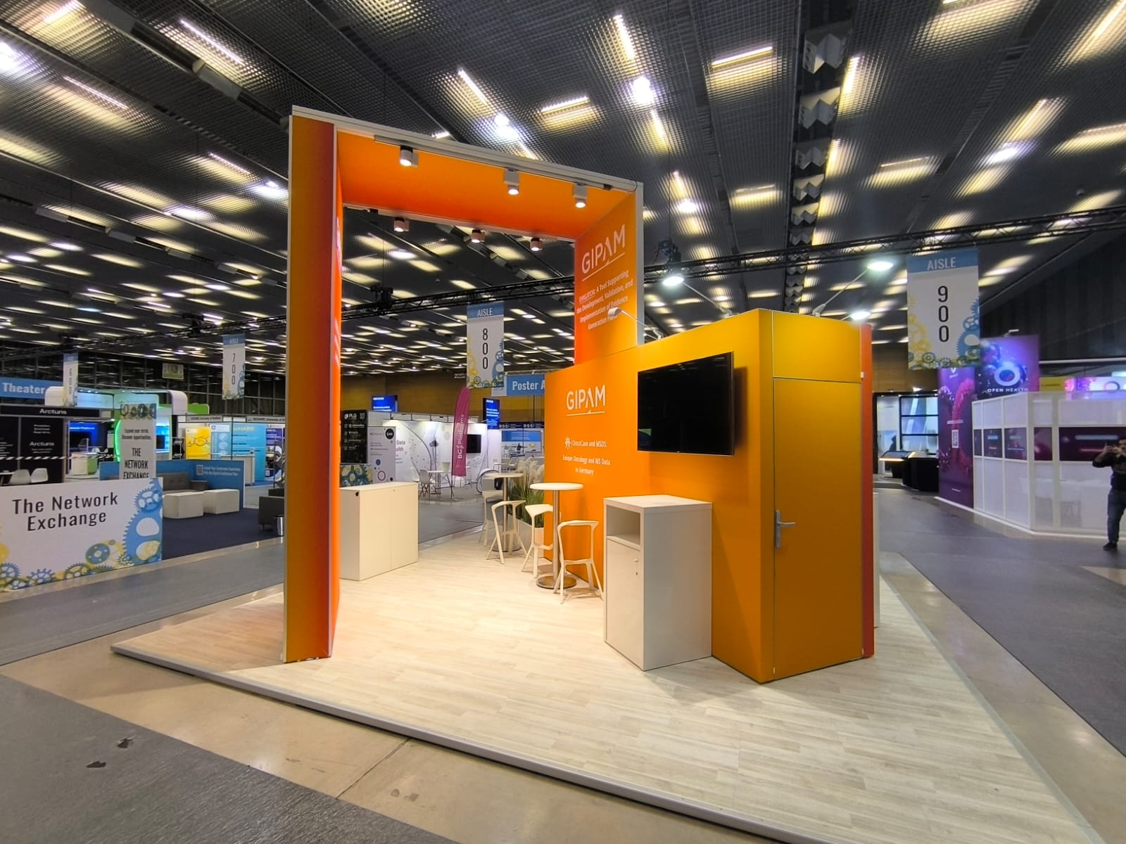
Color is one of the most powerful elements in the design of stands for fairs and congresses. The right tones not only attract visitors’ attention, but also strengthen the brand’s identity and generate specific emotions. In this article, we will explore the color trends that are marking the design of stands and how to choose the perfect palette to stand out at your next event.
The psychology of color in the design of stands
Before choosing the colors for your stand, it is important to understand how the colors influence the emotions and perceptions of visitors. Each tone transmits a different message and can help create the desired atmosphere.
- Blue: Associated with trust, professionalism and calm. Ideal for technological or corporate brands.
- Red: It evokes passion, energy and urgency. Perfect for attracting attention and generating enthusiasm.
- Green: It transmits sustainability, freshness and growth. Excellent for brands with an ecological focus.
- Yellow: It represents optimism, creativity and joy. It works well to get attention at busy fairs.
- Black: It reflects elegance, modernity and sophistication. Recommended for luxury or minimalist stands.
Current color trends in stand design
The color trends at fairs and congresses change every year, influenced by graphic design, fashion and art. Here are the main trends of the moment:
1. Degraded colours
The degraded are fashionable for their ability to create depth and dynamism. Combinations of warm and cold tones bring a modern and attractive effect.
2. Monochrome pallets
The monochromatic pallets offer a clean and elegant design. Choosing different tones of the same color creates a unified and professional aesthetic.
3. Neon colors
The neon colors like the fluorescent rose, lime green or electric blue are gaining ground. These vibrant tones ensure that your stand is visible from any point of the enclosure.
4. Natural tones
Inspired by nature, the earth tones as beige, brown and olive green reflect sustainability and authenticity. They are ideal for ecological stands or well-being-related brands.
5. Bold contrasts
Combinations of opposite colors in the chromatic circle, such as blue and orange or red and green, create a visual impact that does not go unnoticed.
How to choose the perfect color palette
Select the right color palette for your stand requires careful planning. Here are some key tips:
- Meet your audience: Consider the preferences and expectations of those attending the fair.
- Reinforce your brand identity: It integrates corporate colors to maintain coherence and recognition.
- Adapts the color to the message: Use tones that reinforce the message or theme of your stand.
- Prioritizes legibility: Make sure the texts and graphics are easy to read on the chosen background.
Benefits of using strategic colors on your stand
A well-thought-out color design can make a difference in the performance of your stand:
- More attention: The vibrant and strategic colors attract visitors from afar.
- Trademark recognition: They strengthen your company’s visual identity.
- Emotional generation: The right tones create an emotional connection with the attendees.
Frequently asked questions about the use of colors in stands
The ideal is to limit you to 3-4 main colors to maintain a clean and coherent design. You can use variations of these tones to add depth.
Bet by bold or degrade dynamic combinations that differentiate your stand from the rest. You can also add custom lighting to highlight the colors.
Hot tones like red and yellow are ideal for immediate attention, while neon colors work well in environments with low lighting.
Yes, using corporate colors strengthens the identity of your brand and facilitates recognition. Complete with additional tones to add dynamism.
Use a balanced palette based on complementary or monochromatic colors. Keep enough blank space to keep the design from feeling overwhelming.