
- Signage as a Lead-Gen System, Not Decoration
- Key Definitions: How Signage and Leads Connect
- Decision Framework: 4 Signage Functions That Generate Leads
- How Signage Becomes a Lead Capture Funnel
- The 3-Level Messaging Rule Applied to Signage (Procedure)
- Which Types of Signage Convert Best by Lead Goal
- 2026 Signage Trends for Booths: What Changes and How It Impacts Leads
- Signage Design for Leads: Non-Negotiable Checklist
- How to Measure Whether Signage Is Generating Leads (Metrics and Method)
- Practical Examples: Applying the Same Framework to Different Scenarios
- Common Mistakes That Reduce Leads (and How to Fix Them)
- Conclusion: Lead-Generating Signage Converts Attention into Action
- FAQs About Signage and Lead Capture at Trade Shows
Signage as a Lead-Gen System, Not Decoration
At trade shows and conferences, signage is not a “finishing touch.” It’s a communication system that determines three critical outcomes: whether people notice you, whether they understand you, and whether they remember you. When those three conditions are met, signage becomes an accelerator of conversations—and therefore a driver of lead generation.
This approach fits the 2026 Trends cluster: in 2026, booths compete in more crowded halls, with visitors who have less time, and sales teams that need to measure results with greater precision. That’s why effective signage is designed like a visible funnel: attract, qualify, and convert, without relying on improvisation.
And when you talk about European trade shows 2026 booths, signage takes on an added responsibility: maintaining brand consistency across different venues, layouts, and regulations—using modular, reusable solutions. The goal of this article is to give you a rigorous, practical framework to connect signage and leads in an operational way.
Key Definitions: How Signage and Leads Connect
Booth signage (operational definition): the set of visual and textual elements that identify the brand, communicate the value proposition, and guide visitor movement within a trade show or conference space.
Trade show lead (operational definition): a contact with enough data and minimum context (interest, need, or role) to justify sales follow-up with a reasonable chance of progress.
Causal relationship (simple, verifiable explanation): signage influences the volume and quality of interactions because it determines who approaches, with what expectation, and what action they take inside the booth (demo, meeting, registration, scan, download).
Decision Framework: 4 Signage Functions That Generate Leads
Lead-generating signage consistently delivers four functions. This framework repeats throughout the article at different scales: first as strategy, then as design, and finally as execution.
- Visibility: getting noticed from aisles and entrances.
- Understanding: communicating what you do and for whom in seconds.
- Direction: guiding visitors toward a specific action (demo, meeting, registration).
- Trust: reducing perceived risk with credibility signals (proof, case studies, certifications, partners).
If a signage element doesn’t support one of these functions, it likely adds noise, reduces readability, or consumes budget without improving lead outcomes.
How Signage Becomes a Lead Capture Funnel
To connect signage to lead generation, map the visitor journey into three stages. Each stage requires different messages and formats.
Stage 1: Attraction
Attraction is where signage competes for attention. The most useful rule is to reduce the decision to one question: “Is this booth relevant to me?” If the answer takes too long, the visitor keeps walking.
- Goal: earn a pause (a stop) and first visual contact.
- Critical signage: dominant logo, clear category, one benefit-driven headline.
- Common mistake: multiple messages or overly technical language from a distance.
Stage 2: Qualification
Qualification is where signage filters and organizes. It helps the right visitor find the right content without your team having to repeat the basics all day.
- Goal: help visitors self-identify fit and choose what to look at.
- Critical signage: benefit hierarchy, served segments, industry-specific proof points.
- Common mistake: generic claims that don’t differentiate.
Stage 3: Conversion
Conversion is where signage pushes a measurable action. This is where leads are created: registration, scanning, booking a meeting, data capture during a demo, or an identified download.
- Goal: make the action easy and record intent.
- Critical signage: CTA wayfinding, simple instructions, clearly marked capture points.
- Common mistake: relying only on the rep’s initiative—or the visitor’s.
The 3-Level Messaging Rule Applied to Signage (Procedure)
This procedure turns signage into a consistent information architecture—especially useful within 2026 Trends, where clarity wins over visual overload.
- Level 1 (3–5 seconds): who you are + category + who it’s for
- Level 2 (10–20 seconds): 1–3 concrete benefits + a differentiator
- Level 3 (30–90 seconds): proof: a case, contextual metric, certification, or demo
Quality test: if someone who doesn’t know you can’t repeat your Level 1 after a quick glance, your signage isn’t optimized for lead capture.
Which Types of Signage Convert Best by Lead Goal
There’s no single “best signage” in the abstract. There’s only signage that best delivers visibility, understanding, direction, and trust for your goal. Here’s a conversion-focused comparison.
Printed Vinyl and Cut Vinyl Graphics
Why it helps capture leads: it supports large, direct messages on key surfaces (fronts, sidewalls, counters) that steer attention toward the conversation zone.
- Best for: short campaigns, high-impact headlines, floor graphics that guide visitors to demos or registration.
- Risk: too much copy on surfaces meant to be read from far away.
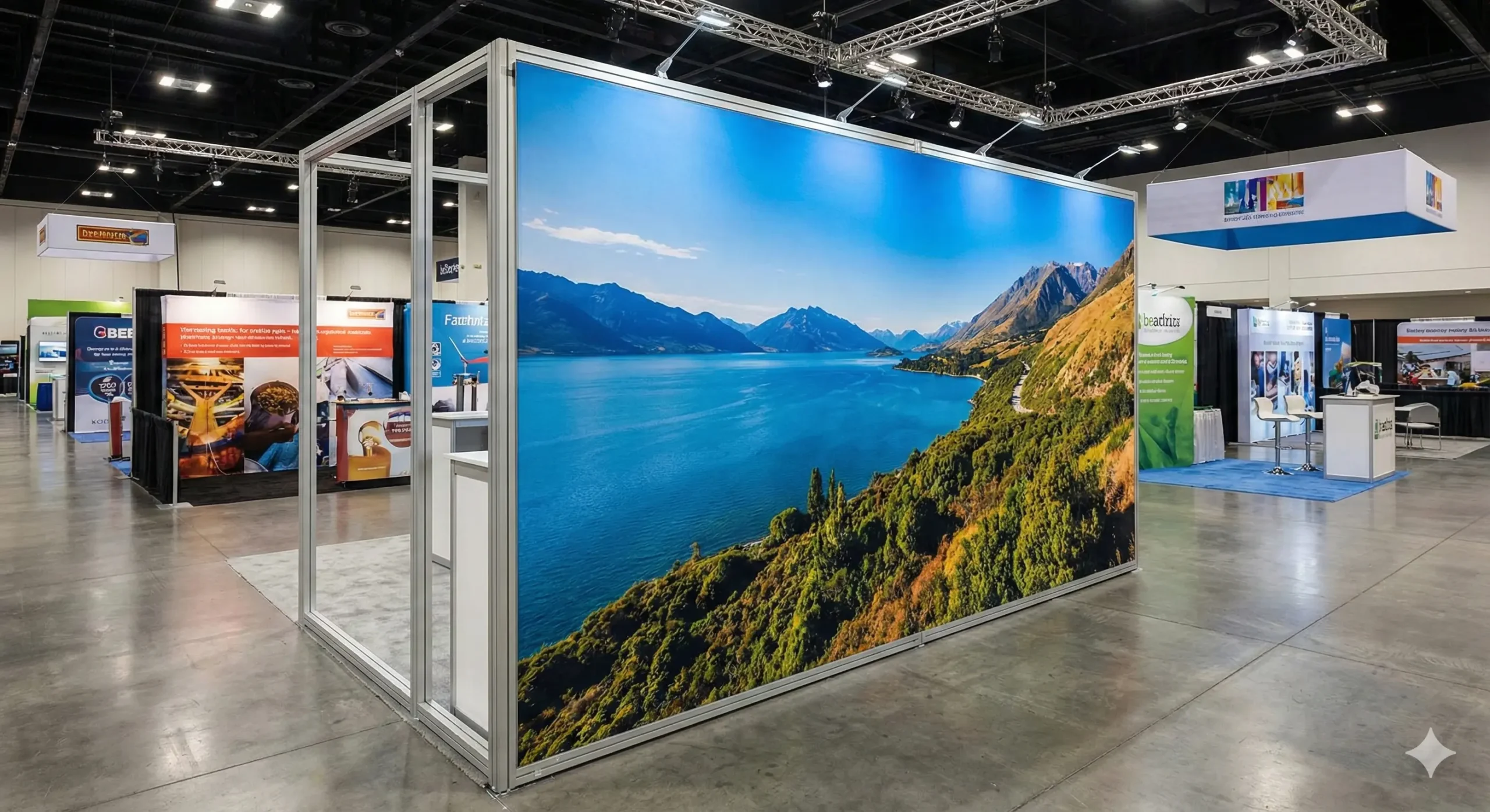
Tension Fabric Graphics
Why it helps capture leads: it creates clean, readable backdrops, reduces glare, and improves brand perception—raising the likelihood of a first conversation.
- Best for: reusable, consistent modular booths in European trade shows 2026 booths.
- Risk: without strong hierarchy, it becomes “pretty but silent.”
Dimensional Logos and 3D Elements
Why it helps capture leads: it improves long-distance recognition and elevates perceived quality, increasing willingness to approach.
- Best for: brand-first booths, premium positioning, tech and industrial categories.
- Risk: if the headline doesn’t qualify, it attracts unqualified curiosity.
Backlit Signage
Why it helps capture leads: it multiplies aisle visibility and improves category + brand readability even under uneven lighting.
- Best for: visually competitive shows and large halls.
- Risk: using light for decoration instead of readability.
Integrated Wayfinding Signage
Why it helps capture leads: it reduces friction, organizes lines, directs visitors to demos and meetings, and turns the booth into a process. A process captures leads better than an “open space.”
- Best for: booths with multiple zones or complex products.
- Risk: wayfinding that conflicts with brand identity.
2026 Signage Trends for Booths: What Changes and How It Impacts Leads
In 2026, signage aligns with three demands: reuse, clarity, and measurement. These trends directly influence lead capture.
1) Modular, Updatable Signage
Graphics are treated as a “variable layer” over a “fixed structure.” This keeps brand consistency while allowing message updates show-to-show without rebuilding the entire booth.
- Impact on leads: faster message iteration based on prior show results.
- How to apply: reusable structure + swap-out graphics + segment-specific headlines.
2) Fewer Headlines, More Semantic Precision
Message overload reduces understanding. In 2026, the booth that wins is the one that precisely defines what it does, for whom, and what outcome it delivers—without exaggeration or vague claims.
- Impact on leads: increases the share of relevant visitors and reduces unproductive conversations.
- How to apply: one main headline + two supporting benefit statements.
3) Action-Oriented Signage Built for Measurable Behavior
Signage includes simple instructions and measurable calls to action: scan, demo, book, download. In 2026, “beautiful” doesn’t compete with “measurable”—you need both.
- Impact on leads: more conversions per visitor by reducing friction.
- How to apply: step signage and highly visible capture points.
Signage Design for Leads: Non-Negotiable Checklist
Use this checklist to review any signage proposal before production.
- Real-world readability: clear type, sufficient contrast, fast scanning.
- Hierarchy: the most important message reads first without effort.
- Consistency: one visual logic across the entire booth (brand, headline, wayfinding).
- Orientation: visitors immediately know where to go to see, try, or talk.
- Credibility: visible proof elements (cases, partners, certifications).
- Action: at least one clear call to action per key zone.
- Reusability: components designed for multiple shows and campaign updates.
How to Measure Whether Signage Is Generating Leads (Metrics and Method)
Without measurement, there’s no improvement. Signage can be evaluated with simple metrics that don’t require complex systems. The goal is to learn whether your messaging turns more visitors into conversations—and more conversations into leads.
Operational Metrics (Short Definitions)
- Stops: number of people who pause in front of the booth.
- Conversations: meaningful interactions with the team or a demo.
- Leads: captured contacts with data and minimum context.
- Stop→conversation rate: measures clarity and message pull.
- Conversation→lead rate: measures direction and ease of action.
- Leads by zone: reveals which area or message converts best.
6-Step Method to Optimize Signage with Data
- Step 1: define the lead goal (volume, quality, or both).
- Step 2: assign one call to action per zone (demo, meeting, scan).
- Step 3: tag each CTA with an identifier (for example, a different QR code per zone).
- Step 4: track stops and conversations in intervals (for example, hourly).
- Step 5: calculate rates and identify bottlenecks (attraction, qualification, or conversion).
- Step 6: adjust variable signage (headline, order, CTA) for the next show.
This method works especially well with modular booths—particularly in European trade shows 2026 booths, where repeating shows with accumulated learning becomes a competitive advantage.
Practical Examples: Applying the Same Framework to Different Scenarios
Scenario A: Small Booth with a Qualified-Lead Goal
Visibility: brand + category on one primary plane.
Understanding: one measurable benefit or specific outcome (no absolute promises).
Direction: one CTA: “book a 5-minute demo” or “schedule a meeting.”
Trust: 2–3 proof points: industries served, typical clients, or a short case snapshot.
Scenario B: High-Traffic Conference with Limited Time per Visitor
Visibility: tall, clean signage with minimal copy.
Understanding: a very short, solution-oriented headline.
Direction: a clear, fast registration point with visible instructions.
Trust: simple credentials: a certification, a partner, or a contextual metric.
Scenario C: Industrial Trade Show with a Complex Product and Demos
Visibility: dominant logo + one summarized technical differentiator.
Understanding: wayfinding by applications or industries.
Direction: staged flow: “1) choose an application 2) watch the demo 3) get the report.”
Trust: an industry case wall with results in context.
Common Mistakes That Reduce Leads (and How to Fix Them)
- Signage without a category: if people can’t tell what you do, they won’t start a conversation.
- Too many primary messages: fewer stops and weaker conversion rates.
- Generic headlines: they attract everyone and qualify no one.
- Invisible or vague CTA: interested visitors don’t know what to do next.
- No proof: there’s curiosity, but not enough trust to share contact info.
- Non-reusable design: repeating shows without improvement wastes time and budget.
Conclusion: Lead-Generating Signage Converts Attention into Action
Within 2026 Trends, signage evolves from aesthetic to functional: a system that creates visibility, understanding, direction, and trust. That sequence turns foot traffic into conversation—and conversation into a lead. The key isn’t “adding more graphics,” but designing a message architecture with hierarchy and measurable calls to action.
If your goal is to compete in European trade shows 2026 booths, treat signage as a strategic booth layer: modular, clear, reusable, and data-optimizable. When signage aligns with the funnel, it stops being a cost and becomes a lead-generation asset.
FAQs About Signage and Lead Capture at Trade Shows
Include your brand, a clear category, and one primary benefit. Add a simple call to action (demo or meeting) plus one proof element (case study or partner) to build trust.
It depends on viewing distance. As a practical rule: the farther it must be read, the fewer words you should use and the larger the type should be—prioritize legibility and contrast over copy volume.
Use a benefit-led headline, three supporting bullets, and a highly visible CTA with a QR code or clear instruction. Avoid paragraphs and place proof (typical client or contextual metric) near the CTA.
Signage communicates identity and value proposition; wayfinding guides actions and movement. To capture leads, you need both working together without contradictions.
Vinyl is often competitive for short campaigns; fabric graphics tend to win when you need reuse and consistency across multiple shows. Cost-effectiveness depends on how many times you plan to reuse the system.
Track stops, conversations, and leads, then calculate stop→conversation and conversation→lead rates. If a rate drops, adjust messaging or the CTA to reduce friction.
Apply three-level hierarchy: one primary message, two or three supporting points, and proof. Reduce copy, increase contrast, and remove elements that don’t improve understanding or action.