
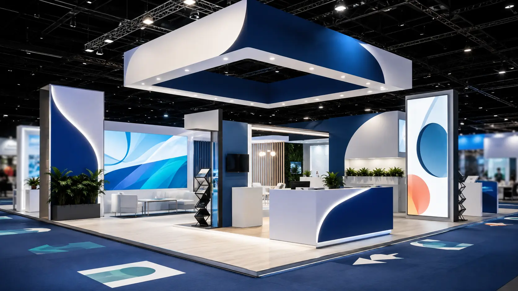
Trade show signage is a communication system
Trade show signage is not simply about placing a logo on the walls of a booth. It is a visual communication system designed to help visitors identify a brand, understand what it offers, navigate the space, and decide whether it is worth starting a conversation.
This role is especially important at trade shows and conferences, where multiple exhibitors compete for attention at the same time. Architecture can help a booth stand out physically, but signage is what turns that space into a message visitors can quickly understand.
Effective signage connects ten elements: purpose, identity, hierarchy, readability, color, scale, substrate, lighting, spatial integration, and execution quality. None of them works entirely on its own. A sign may have an attractive design but fail if it cannot be read from the aisle. A print may offer excellent technical quality but add little value if the main message is generic. An illuminated sign may attract attention but lose coherence if it does not accurately represent the brand.
For this reason, trade show booth fabrication and signage should be planned together. Wall dimensions, materials, lighting, visitor pathways, and the directions from which attendees approach the booth all influence how each graphic element should be designed.
These are the ten elements that help create clearer, more consistent trade show signage designed to support commercial objectives.
What trade show signage is and what it should accomplish
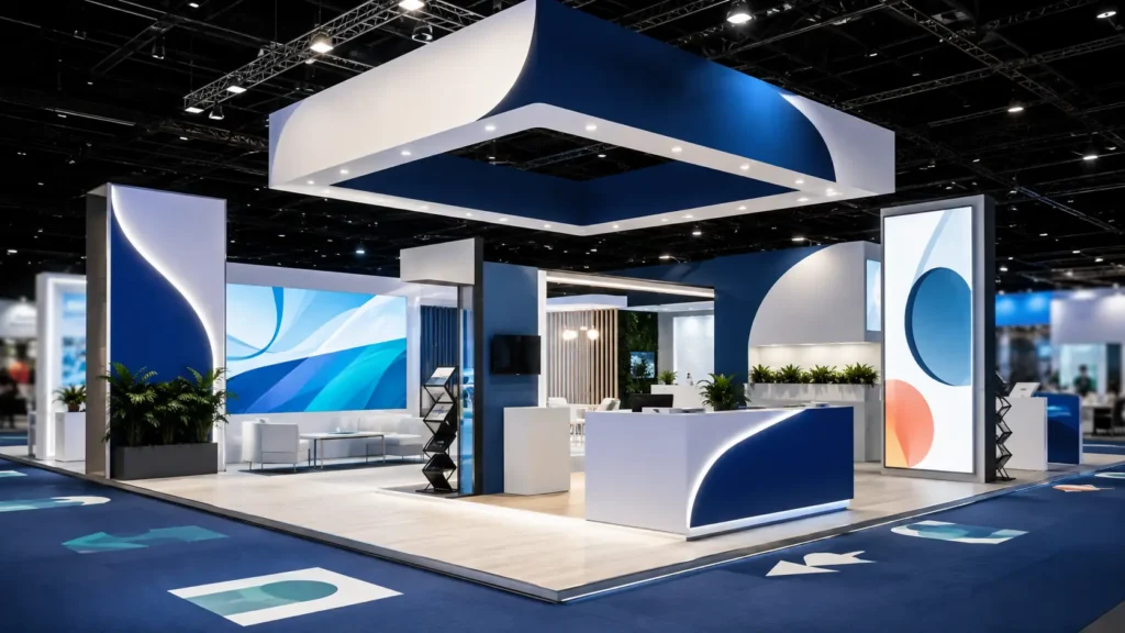
Trade show signage (definition): an organized system of graphic, textual, three-dimensional, and wayfinding elements used to identify a brand, communicate information, and guide visitors within a trade show booth, exhibition, or conference.
It may include:
- Logos and dimensional lettering.
- Printed and cut vinyl graphics.
- Fabric graphics.
- Rigid graphic panels.
- Lightboxes and backlit graphics.
- Wayfinding signage.
- Floor graphics.
- Banners and overhead elements.
- Promotional messaging.
- Product-related graphic displays.
A strong signage solution should fulfill four basic functions: attract, identify, explain, and guide. This same framework can be used to evaluate each of the ten elements below.
1. A clear purpose for every signage element
The first requirement is knowing exactly what each piece is supposed to accomplish. Adding messages without a specific function increases visual noise and makes the booth harder to understand.
A signage element may be intended to:
- Identify: make the brand visible from the aisle.
- Attract: highlight a new product, feature, or benefit.
- Explain: clarify a category, solution, or application.
- Guide: direct visitors toward reception, a demonstration, or a meeting room.
- Convert: encourage an action such as requesting information, booking a demo, or scanning a code.
Problems arise when a single surface tries to perform all these functions at once. A header designed to be read from 65 feet away should not contain the same amount of information as a product panel viewed from a few feet away.
Practical guideline: before designing a graphic, complete the sentence “this piece should get the visitor to…”. If there is no precise answer, the element probably does not yet have a clearly defined purpose.
2. Consistent brand identity
Signage should allow visitors to recognize the company even before they read every message. To achieve this, the brand’s visual system must be translated accurately into the physical environment.
Consistency applies to:
- The logo and its approved variations.
- Color palette.
- Typography.
- Photography style.
- Iconography.
- Tone of voice.
- Brand-specific shapes and graphic devices.
This does not mean every surface has to repeat exactly the same graphic treatment. Consistency means creating a recognizable family of visual elements.
Architecture also plays a role. If a company wants to communicate technological precision, its graphics, finishes, and lighting should reinforce that perception. If the visual concept and physical execution contradict the desired positioning, the branding becomes weaker.
Trade show signage should therefore be treated as an extension of the corporate identity rather than as a separate decorative layer.
3. Visual hierarchy of information
Visitors do not process all information at the same time. They first notice the dominant elements and then decide whether to pay attention to secondary messages.
A practical hierarchy can divide content into three levels:
- Level 1: brand and primary value proposition.
- Level 2: categories, benefits, solutions, or products.
- Level 3: specifications, case studies, details, and calls to action.
This structure allows signage to work both for visitors walking quickly past the booth and for those who step inside and look for more detailed information.
Hierarchy is created through size, position, contrast, spacing, and typographic weight. If every message has the same visual importance, nothing truly stands out.
Key principle: the more important a message is for initiating interaction, the fewer elements should compete with it.
4. Readability and typography selection
A message that cannot be read under actual show-floor conditions does not fulfill its purpose, regardless of how attractive the design may be.
Readability depends on:
- Text size.
- Viewing distance.
- Contrast with the background.
- Character weight.
- Line spacing.
- Message length.
- Lighting.
- The angle from which the visitor approaches.
Corporate typefaces can be used as long as they remain easy to read. A font that works well on a website or in a brochure is not necessarily the best option for letters several feet tall or for directional signage.
Long copy should also be limited. A visitor walking through an aisle does not behave like someone reading a web page. Primary trade show signage needs messages that can be understood quickly.
Detailed content can be reserved for screens, technical sheets, brochures, or areas where the visitor has already stopped.
5. Controlled color and contrast
Color serves two functions: it reinforces brand recognition and helps organize information.
An effective color combination should:
- Differentiate text from the background.
- Emphasize priority messages.
- Maintain brand consistency.
- Perform properly under venue lighting.
- Maintain a reasonably consistent appearance across different materials.
The last point is particularly important. The same color may appear different when reproduced on vinyl, fabric, rigid board, acrylic, or a backlit graphic.
Professional color management uses profiles, calibration, and physical proofs to control these variations. The goal should not be to assume every surface will produce an identical result, but to create a visually consistent overall booth.
When a brand color is critical, testing it on the final material is far more reliable than evaluating it only on a monitor.
6. Scale and viewing distance
The position of a graphic determines its size and level of detail. This relationship is one of the easiest factors to overlook when designing on a screen.
Trade show signage can be organized according to three viewing distances.
Long distance
Its purpose is to help visitors locate the booth. It should prioritize:
- Brand name or logo.
- Recognizable shapes.
- Contrast.
- Very few elements.
Medium distance
It helps visitors decide whether to enter. It may communicate:
- Industry.
- Product.
- Application.
- Primary benefit.
Short distance
It is used once the visitor is already inside the booth. It can include:
- Technical information.
- Application examples.
- Specifications.
- QR codes.
- Contact information.
Designing around these three viewing distances prevents a single graphic element from being expected to solve every communication need.
7. The right substrate and material
The substrate should not be selected based on appearance alone. It must respond to the application, booth construction system, required lifespan, and logistics of the project.
Common trade show signage options include:
- Adhesive vinyl: suitable for customizing a wide range of surfaces and updating campaigns.
- Fabric graphics: useful for frames, tensioned walls, and lightboxes.
- Rigid panels: appropriate for signage, product imagery, and freestanding graphic pieces.
- Acrylic: used for decorative, directional, and illuminated applications.
- Dimensional lettering: adds depth and three-dimensional presence.
- Backlit materials: designed to work with a light source behind the graphic.
Each substrate has different characteristics in terms of weight, flexibility, finish, transportation, and reusability.
Fabric graphics, for example, are widely used in exhibition environments. FESPA identifies benefits such as low weight, easy storage, and the potential to reuse certain graphics. However, actual sustainability depends on the fabric composition, inks, logistics, and end-of-life treatment.
There is therefore no universally superior material. There is only a material that is more appropriate for a specific application.
8. Lighting integrated with signage
Lighting can turn an effective graphic into a dominant visual element or cause an apparently clear message to lose contrast.
It should be planned together with signage rather than added after the graphics have been completed.
Common applications include:
- Front lighting for graphic walls.
- Backlighting for fabric or rigid panels.
- Illuminated dimensional letters.
- Accent lighting for key messages or products.
- LED integration within booth structures.
In a lightbox, for example, the print, color density, diffuser material, structure depth, and distribution of light sources all need to be coordinated.
Uneven lighting can create brighter and darker areas. An unsuitable color temperature can alter the perception of certain finishes. Reflections can also reduce readability on glossy surfaces.
Validation guideline: graphics should be evaluated with the final lighting switched on and from the actual visitor approach angles.
9. Integration with architecture, visitor flow, and wayfinding
The most effective signage is part of the booth architecture. It does not look as though it was added after construction was completed.
This integration requires coordination with:
- Walls and heights.
- Entrances.
- Reception areas.
- Products.
- Audiovisual zones.
- Meeting rooms.
- Storage areas.
- Demonstration points.
Wayfinding connects these areas. Its purpose is to reduce uncertainty and help visitors understand where they should go.
An effective system may include:
- Identification signage: what the area is.
- Directional signage: where to go.
- Informational signage: what happens at that location.
- Calls to action: what the visitor should do next.
For example, a screen announcing a product demonstration works better if the signage helps visitors find it quickly and the access route is not blocked by furniture.
Architecture and signage should share the same visitor experience map.
10. Production and installation quality
The final element turns the design into reality. Poor technical execution can undermine an excellent concept.
Before production, the following should be reviewed:
- Final dimensions.
- Image resolution.
- Fonts.
- Bleeds.
- Scales.
- Colors.
- Panel breakdowns.
- Finishes.
- Mounting systems.
During installation, the following should be checked:
- Graphic alignment.
- Absence of bubbles or wrinkles.
- Continuity between panels.
- Correct tension of fabric graphics.
- Position of signs.
- Lighting performance.
- Surface cleanliness.
- Visibility from the aisles.
Coordination with trade show booth fabrication is critical. The production team needs to know where profiles, joints, doors, utilities, or material transitions will be located so the artwork can be adapted correctly.
The FESPA Print Census 2023 provides useful context for this priority within the print and signage industry. Among 1,778 participants, 55% said one reason for investing in new technology was to access new markets and offerings, 53% cited improving print quality, and 52% cited reducing unit costs. Respondents could select multiple answers, so the percentages do not represent mutually exclusive categories. The findings reflect the simultaneous importance of quality, flexibility, and efficiency within the industry.
The 10 key elements of trade show signage in one guide
- 1. Purpose: determine what each piece needs to accomplish.
- 2. Identity: represent the brand accurately.
- 3. Hierarchy: organize information by importance.
- 4. Readability: make messages easy to read under real-world conditions.
- 5. Color: maintain contrast and visual consistency.
- 6. Scale: adapt content and size to viewing distance.
- 7. Substrate: choose the material according to application and lifespan.
- 8. Lighting: use light as part of the graphic system.
- 9. Integration: connect graphics, architecture, visitor flow, and wayfinding.
- 10. Execution: produce and install with precision.
The real value appears when these ten criteria work together. Optimizing one while ignoring the others produces an unbalanced result.
How to evaluate whether trade show booth signage works
Effectiveness should not be judged only by a subjective impression of whether the booth looks attractive.
It is more useful to analyze metrics linked to visitor behavior:
- Findability: how easily invited attendees can locate the booth.
- Stopping behavior: how many people slow down or pay attention.
- Entry: the proportion of visitors who enter the space.
- Understanding: how easily visitors identify what the company offers.
- Navigation: how easily products and areas can be located.
- Interaction: conversations or demonstrations initiated.
- Recall: subsequent recognition of the brand.
- Conversion: meetings, leads, or other actions generated.
Not all of these results can be attributed exclusively to signage. Booth location, the product itself, pre-show marketing, and the sales team also influence performance. For this reason, analysis is more useful when it compares similar events and documents the changes made from one show to another.
Sustainable signage: prioritize reuse over generic claims
Sustainability should also be incorporated into graphic design using measurable criteria.
A strategy may include:
- Using reusable graphic structures.
- Separating permanent brand elements from temporary messages.
- Replacing only the elements that have changed.
- Designing formats compatible with future trade shows.
- Protecting fabric graphics and signs for storage.
- Monitoring transportation volume and weight.
- Tracking the number of times each element is used.
- Planning the end-of-life destination of materials.
The 2024 edition of ISO 20121 establishes an international framework for systematically managing the social, economic, and environmental impacts associated with events. It does not prescribe a specific signage material, but it reinforces the need to approach sustainability as a managed and measurable process.
Within the printing and signage industry, FESPA also identifies sustainability and the shift toward new visual communication solutions as relevant factors in the transformation of the market.
Common mistakes that reduce the effectiveness of trade show signage
- Using too much text: forces visitors to make unnecessary effort.
- Designing only on screen: hides problems related to scale and viewing distance.
- Using generic messages: fails to explain why the company is relevant.
- Repeating the logo without hierarchy: adds visual clutter without providing more information.
- Ignoring lighting: can reduce contrast and alter colors.
- Not testing materials: can produce unexpected differences in finish.
- Separating signage from booth construction: increases incompatibilities between graphics and structure.
- Ignoring approach angles: can leave important messages outside the visitor’s field of view.
- Creating inconsistent wayfinding: makes navigation more difficult.
- Failing to inspect the installed result: prevents problems from being identified before the show opens.
How Full-Expo integrates signage with trade show booth fabrication
The main advantage of coordinating signage and construction is that both disciplines can be developed from the same technical project.
Full-Expo provides trade show booth fabrication and installation, signage, large-format printing, dimensional and illuminated lettering, and lighting, in addition to in-house carpentry, assembly, painting, and logistics capabilities.
According to Full-Expo’s corporate information, its production and storage facilities cover approximately 2,000 m² and are located about 250 meters from Fira Barcelona. This infrastructure makes it possible to centralize multiple stages of a project rather than treating graphics as an isolated supply item.
For a signage project, that integration may include:
- Technical definition: review of drawings and surfaces.
- Prepress: checking final artwork, scales, and panel breakdowns.
- Large-format printing: production adapted to the selected substrate.
- Vinyl graphics: graphic elements for walls, furniture, and other surfaces.
- Fabric graphics: solutions compatible with tensioned and reusable structures.
- Dimensional and illuminated lettering: three-dimensional and illuminated brand identification.
- Wayfinding: functional organization of the space.
- Lighting integration: coordination between graphics and illumination.
- Installation: setup alongside the other booth components.
- Final quality control: review of alignment, visibility, and finish.
The goal is not to incorporate as many graphic resources as possible. It is to select the elements that help the brand be identified, understood, and remembered.
Conclusion: effective signage turns surfaces into communication
The ten key elements of trade show signage form an interconnected system. Purpose determines what needs to be communicated. Identity defines how the brand should be recognized. Hierarchy organizes the messages. Readability, contrast, and scale make those messages understandable. The substrate and lighting determine how they are physically expressed. Spatial integration organizes the visitor experience. Finally, precise production and installation turn the design into a real-world result.
This same logic explains why signage should be designed together with trade show booth fabrication. Graphics need to understand the architecture, and the architecture needs to provide the right spaces for communication.
Effective signage is not necessarily the solution with the most elements or the most complex technology. It is the solution that helps visitors find the brand, quickly understand its value proposition, and move toward a relevant interaction.
Full-Expo can coordinate fabrication, printing, signage, lighting, and installation within a single project, helping preserve the original creative intent from the design stage through the opening of the show.
If you are preparing a new booth, Full-Expo can help you define a signage solution adapted to the space, your brand identity, and the goals of your next event.
Frequently asked questions about trade show signage (FAQs)
Trade show booths can use vinyl graphics, fabric graphics, printed panels, dimensional lettering, lightboxes, wayfinding signage, floor graphics, and other media adapted to the booth design.
There is no universal solution. The right choice depends on viewing distance, surface type, required lifespan, brand identity, lighting, and potential for reuse.
Signage communicates brand identity and marketing messages, while wayfinding is primarily used to identify areas, guide movement, and make navigation easier.
It is the production of large-scale graphics on materials such as vinyl, fabric, banner material, or rigid panels for visual communication in trade show booths, buildings, events, and commercial spaces.
Dimensional lettering adds depth to a logo or message, supports different finishes and integrated lighting options, and can improve brand visibility from multiple viewing angles.
Yes. Dimensional signs, frames, certain fabric graphics, and other components can be reused if they are properly designed, removed, transported, and stored.
It should be calculated according to viewing distance, height, viewing angle, available space, message length, and the other elements competing for visual attention.
It should prioritize the brand, business category or value proposition, and the messages needed to guide interaction. Secondary details can be placed on materials intended for close-up reading.
It should be planned during the booth design phase, before fabrication, utilities, and lighting are finalized, to ensure the correct dimensions, substrates, and locations.
It can be evaluated through visibility, message comprehension, booth entries, visitor interactions, brand recall, and the commercial actions generated during the event.